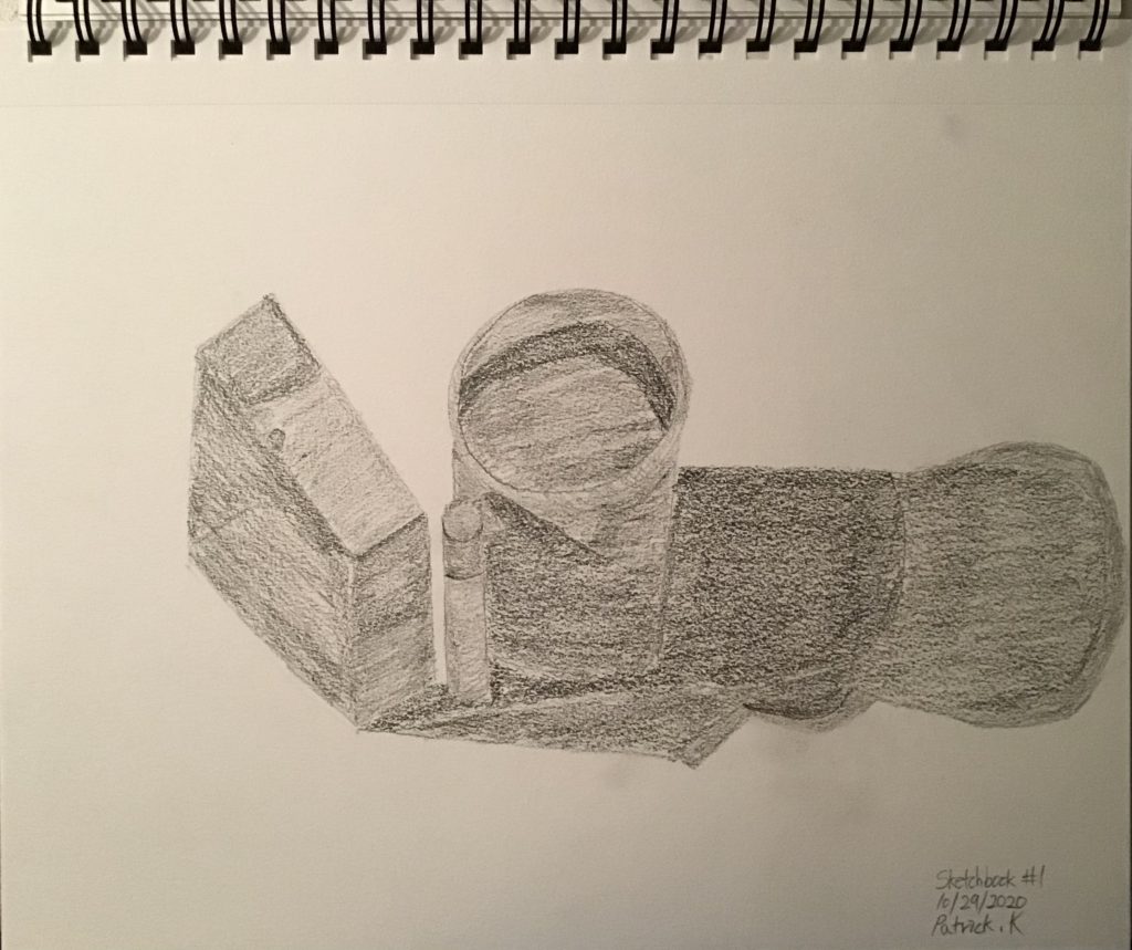
FIN 110 Unit 3
For this assignment, I chose two artists to research: Julia Randall & Daniel Zeller!
Julia Randall
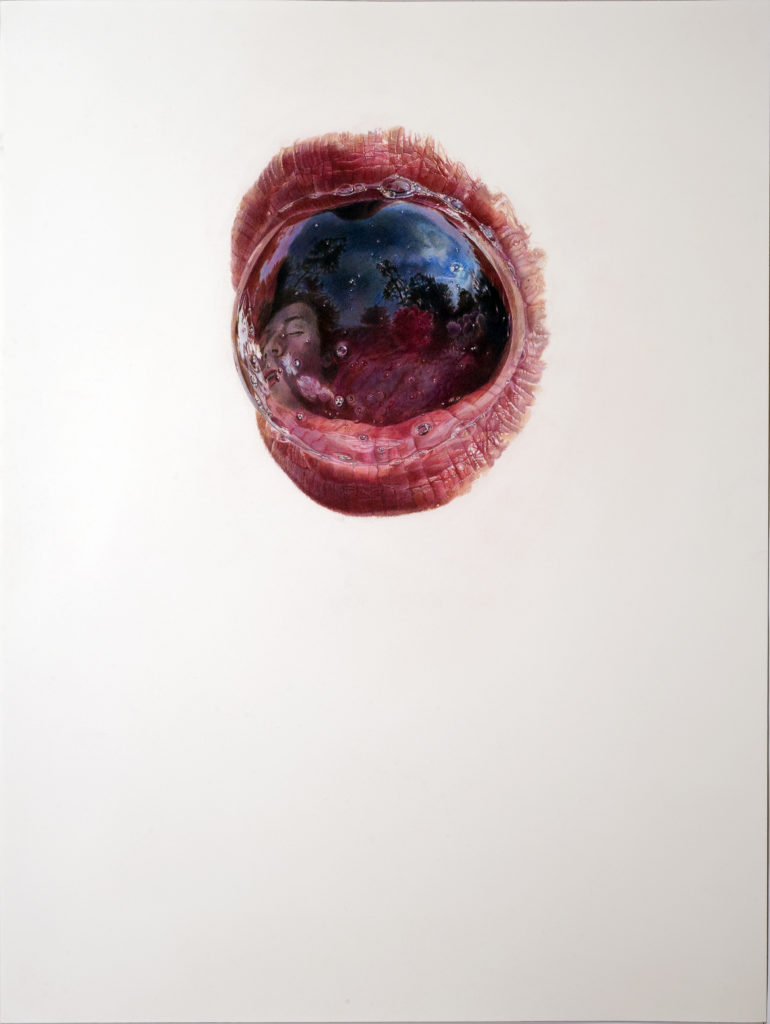
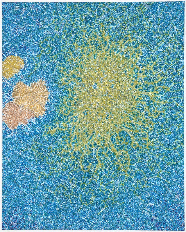
24” x 18”
colored pencil on paper
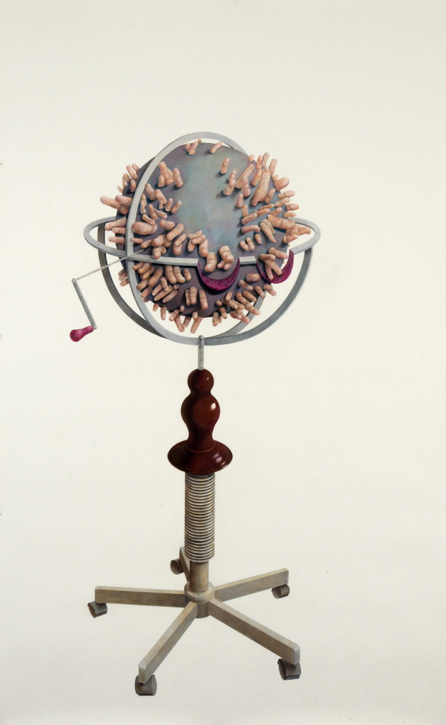
96” x 60”
colored pencil on paper

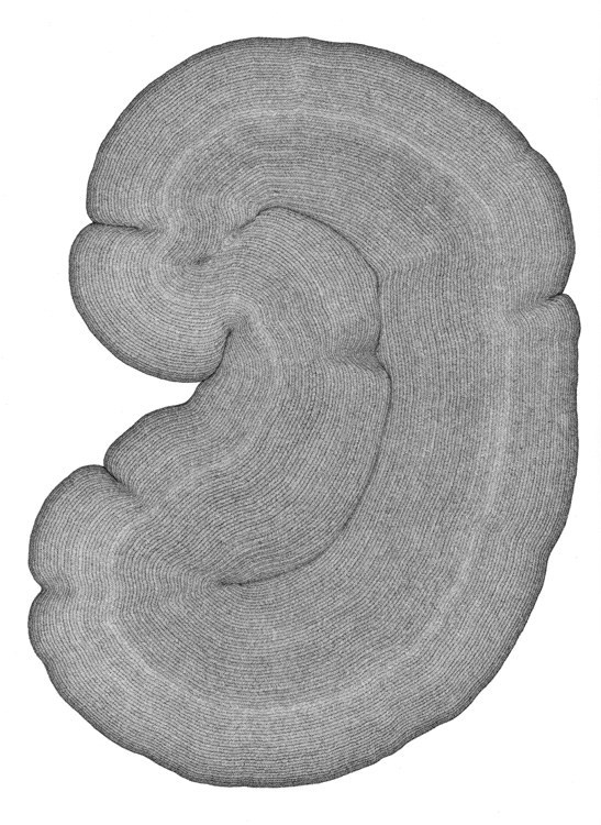
30” x 22”
colored pencil on paper

45” x 52”
colored pencil on paper
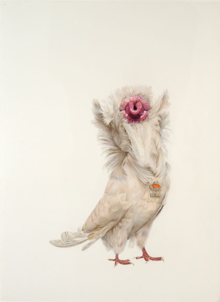
30” x 22”
colored pencil on paper
https://www.julia-randall.com/
*Julia only owns the website above.*
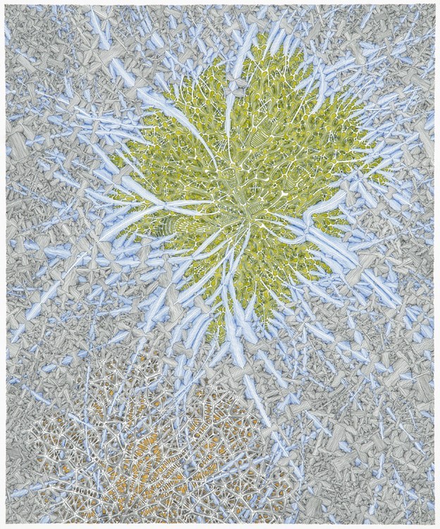
Daniel Zeller
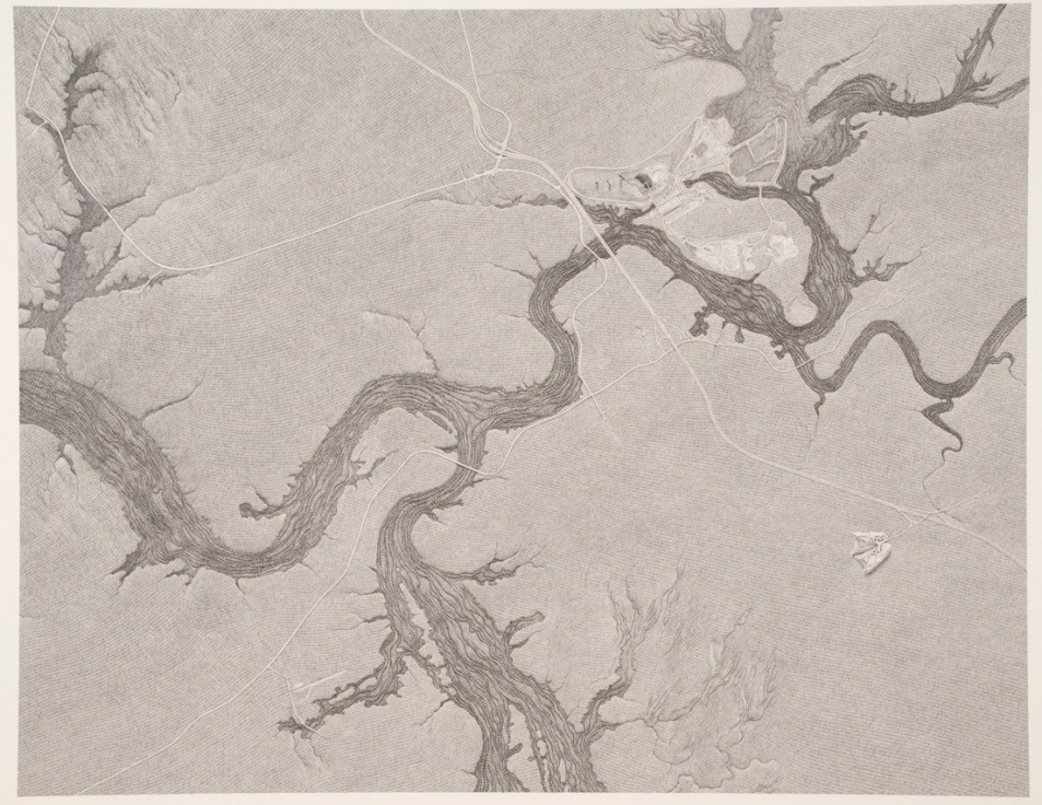
https://www.pierogi2000.com/artists/daniel-zeller/
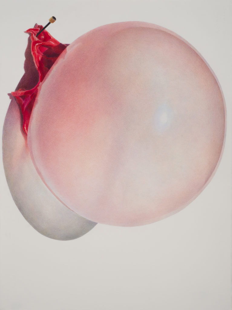

How is the work made?
1: Medium – Only colored pencils were used.
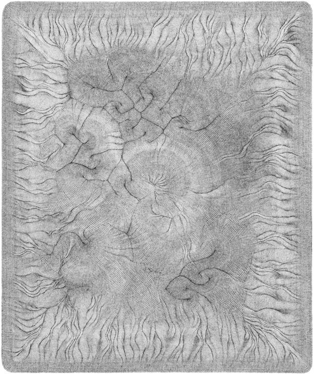
Size: 30″x22″
2. Medium: Ink and Acrylic were used.
Size: 21.5″ x 13″
What are the formal elements of the artwork?
1: Shape, Colors, and Balance are used in this drawing.
2: Lines, Movement, Colors, and Patterns are used in this drawing.
What is the context of the work?
1: Pinned Peach was drawn in around 2014-2015 and it was made in New York City, New York as Julia lives and works there. This drawing relates to the scientific subject (human body) which Julia also mentioned on her page.
2: Overconnection was drawn in 2019 and it was made in his studio, Brooklyn, New York as Daniel Zeller lives and has a studio there. This drawing also relates to the scientific subject(human nerves). Daniel also mentioned that his drawings might result in some kind of scientific inquiry but didn’t mention what he actually draws about(I think he lets his audiences to evaluate what he draws and what he wants to convey).
Describe the content/subject of the work.
1: It is a drawing called “Pinned Peach.” It is about the vulnerability of skin(drawing it as swollen to convey that it can pop anytime!) as well as the pain by pinning the skin of a peach.
2: It is a drawing called “Overconnection.” It is about human nerves showing that bringing many ideas into one place and overload. I think this is part of the ongoing theme for Daniel because he draws a lot about scientific stuff.
What is the mood of the work?
1: The mood of this work is sensitive and fragile. I think this drawing will affect me in a way to add sensitivity in my final drawing.
2: The mood of this work is dynamic, flowy, and complex. I think this drawing will affect me in a way to convey my drawing more complex.
Similarities/Differences between Julia Randall and Daniel Zeller
Similarities: Both artists draw about things related to the human body(both psychological and physiological).
Both artists use colors for their drawings.
Differences: They use different mediums(Julia uses color pencils and Daniel uses ink or graphite.).
They have different styles of drawing (Julia uses observation-based drawing and hyper-realistic technique to create images that are surreal and suggestive, on the other hand, Daniel uses repetition of lines (it could be short, long, and rhythmic).
How might their work inspire/influence your own studio practice?
I think their work will inspire in a way to express my drawing more hyperspatial and somewhat grotesque.
Brainstorming
Thumbnail Sketches

The first one shows the seclusion and loneliness for the character as people(hands) who were surrounding and caring for the character fade away.
The second one is about the emotions(anxiety) about how I would feel right now and over the last few months.
The third one is actually inspired by one of Julia’s many works. It displays the harmful things coming out of someone’s mouth.
And lastly, the fourth one is about the birth of new life. I didn’t mean to degrade the birth of new life and I wanted to convey something mysterious and grotesque here so I added some dots, zig-zag ish lines, and scratchy lines. From these four ideas, I decided to choose the second idea: which conveys anxiety and uneasiness. The reason I chose that idea is that it is about how I felt over the last few months while taking college classes online and I felt like I would deliver my message the best with this idea.
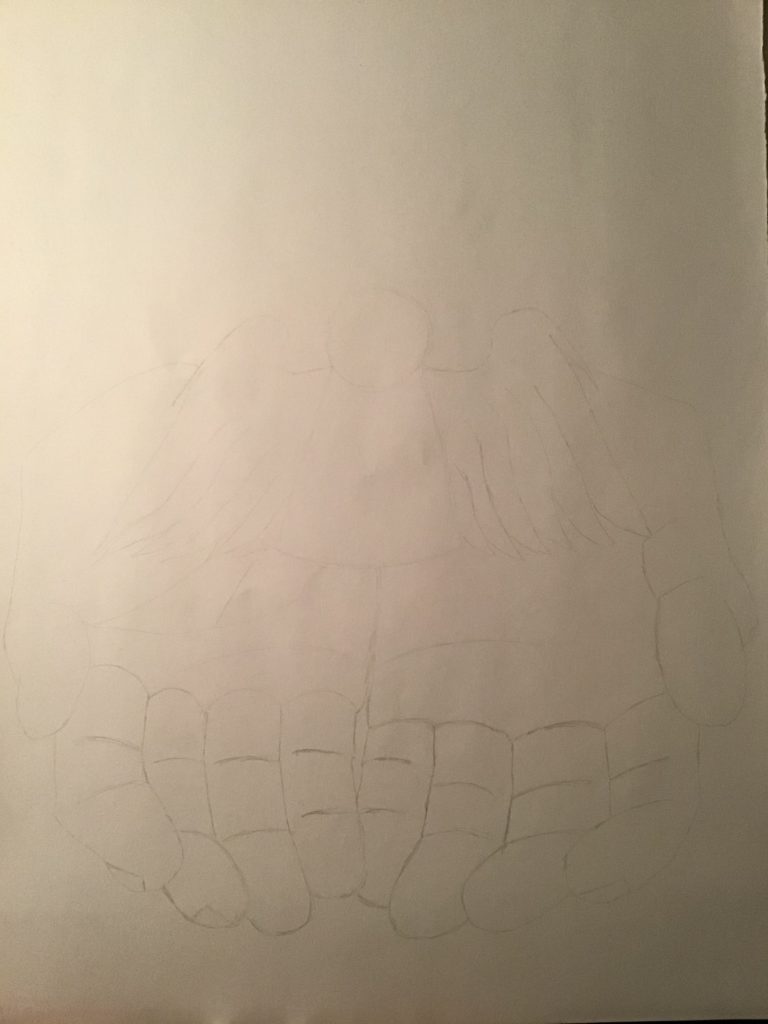
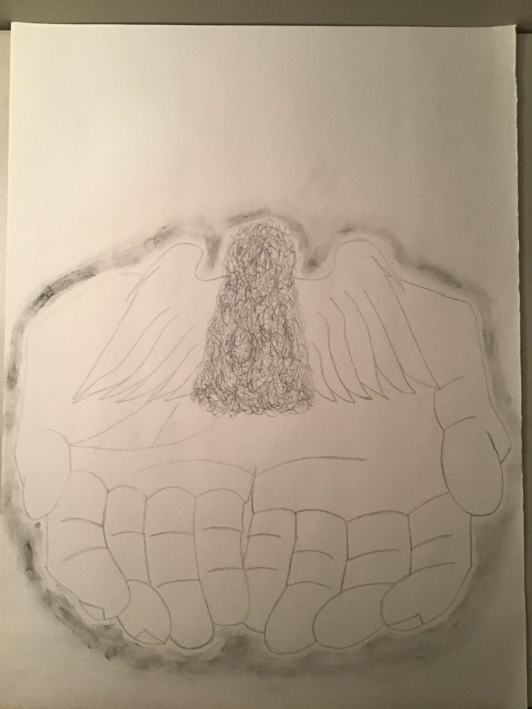
Progress
Title: Unease
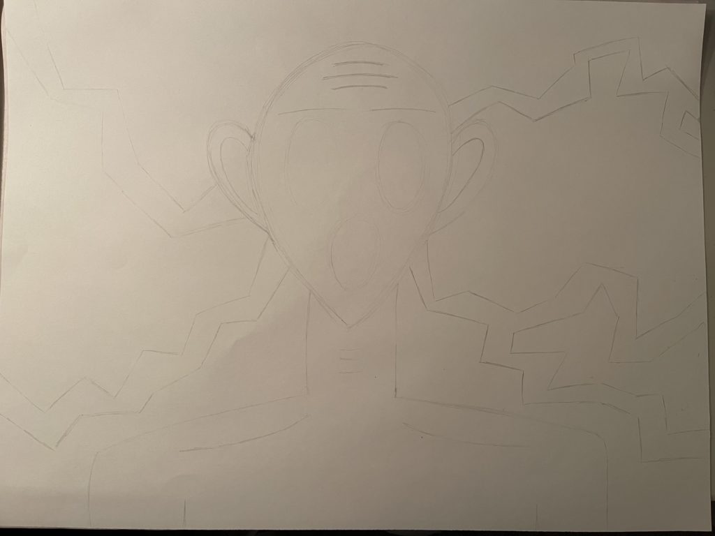

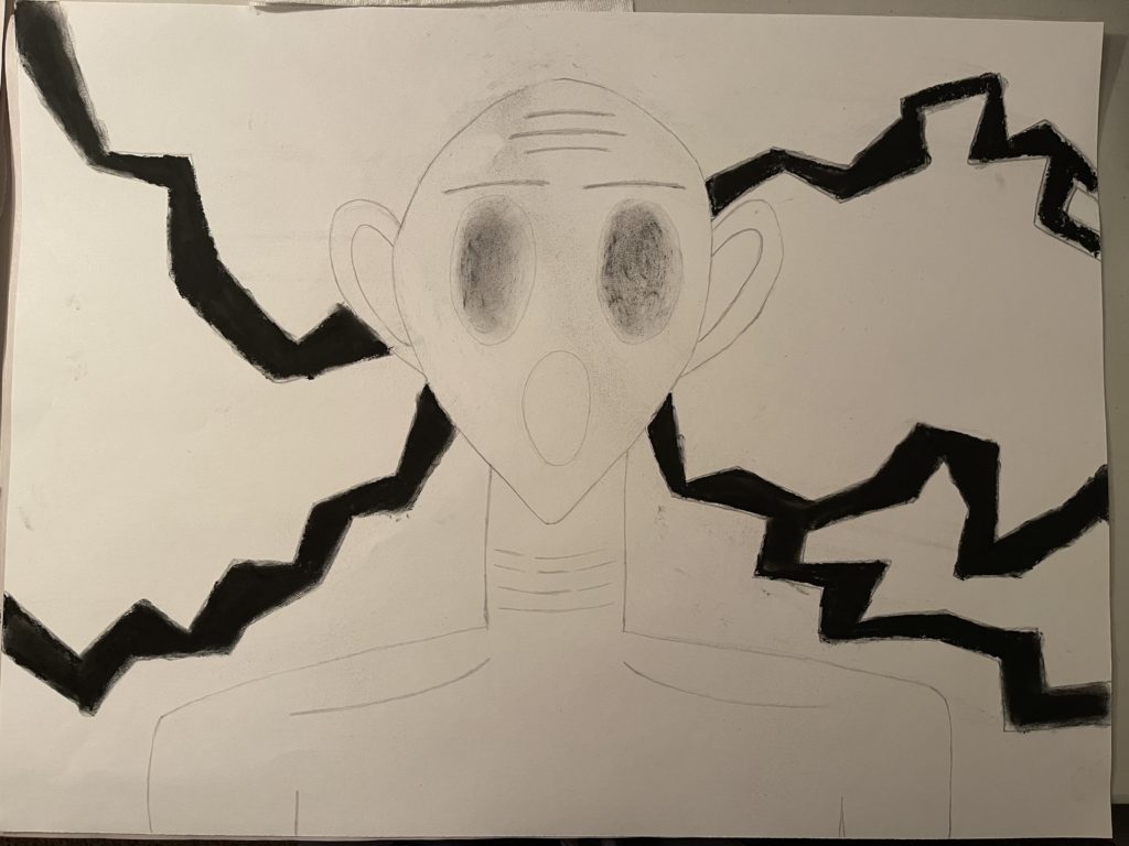

Thank you for teaching throughout the term, Linda! This was a meaningful class to learn more about drawing:) To be honest, it was challenging taking an art class online but I feel like I’ve learned a lot about art since I enrolled in this course. I don’t have any Fine Art class next term but hopefully, I can join one of your classes again in the future. Stay safe and happy early holidays!
-Patrick-
FIN 110 Unit 2
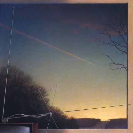
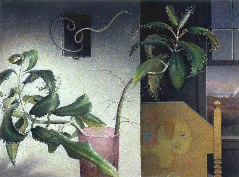
For this assignment, I chose two artists to research: Rob Evans & Ian Ingram
Rob Evans

2004
Acrylic and Oil on Prepared Paper
26 x 19 inches
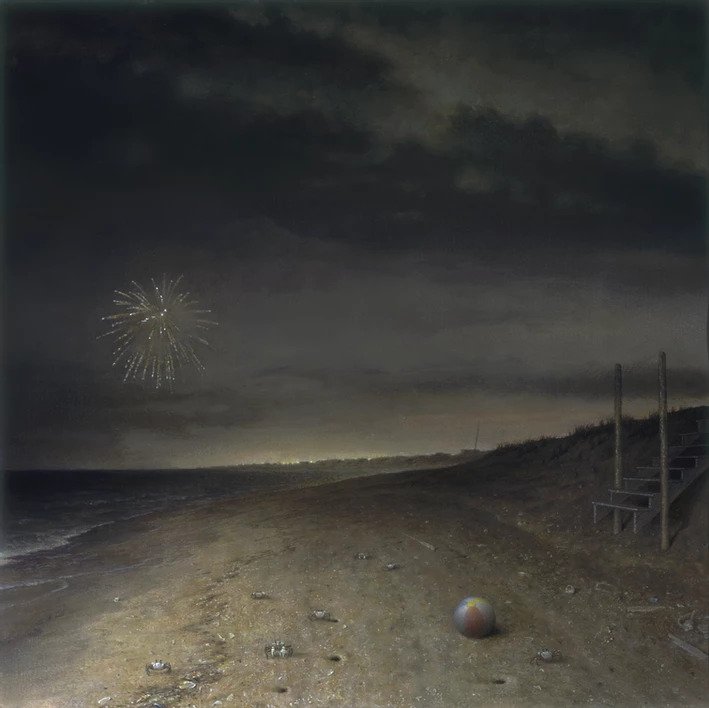
https://www.robevansart.org/ – current website
http://www.robevansart.net/ – old website, no longer maintained
Ian Ingram
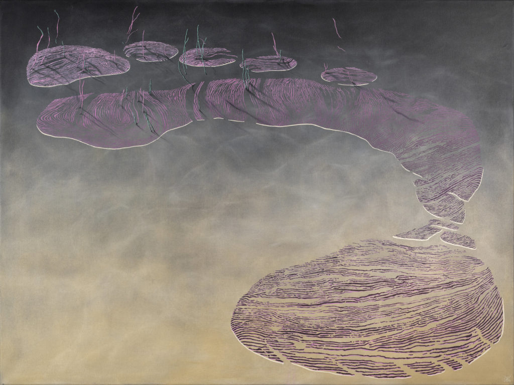
2019
Oil and Enamel on Canvas
46 × 62 in
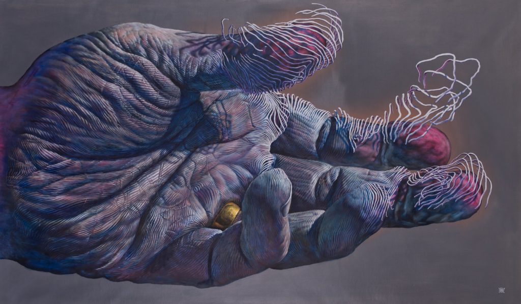
2019
Archival Print On Matte Finish Etching Paper
11 X 19.5 & 20.5 X 36 inches (Both are sold out on Ian Ingram’s Website)
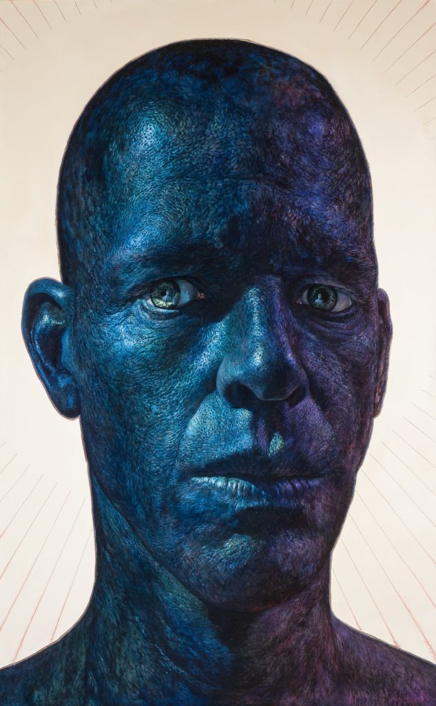
2015
Oil and Wire on Panel
76 x 47 inches
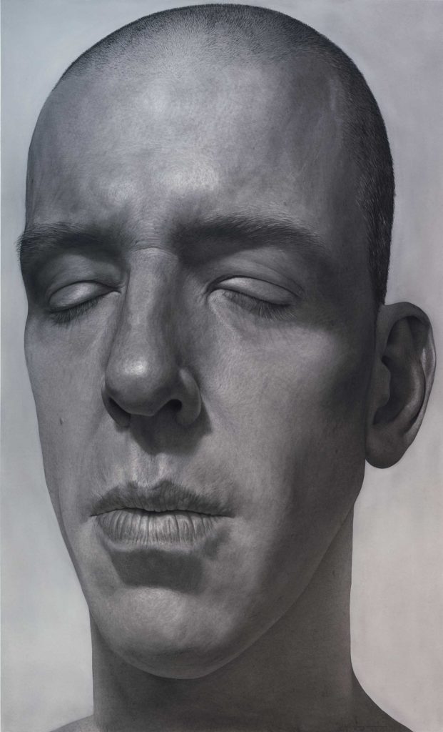
2012
Charcoal and Pastel on Paper
82 1/2 x 51 inches

2013
Charcoal and Pastel on Paper
68 x 42 inches

2010
Charcoal, Pastel, Watercolor, and Gold Leaf on Paper
82 1/2 x 51 inches
Analyzation of Rob Evans
- Charcoal
Analyzation of Ian Ingram
- Charcoal
Similarities & Differences
Similarities: Both artists use
Differences: Rob Evans portrays more of nature, mixed media, and Ian Ingram portrays more of his self-portrait and body parts.
How might their work inspire/influence your own studio practice?
Their work might inspire in a way of composing my drawing. I think I’ll be drawing by
Brainstorm
Project Development
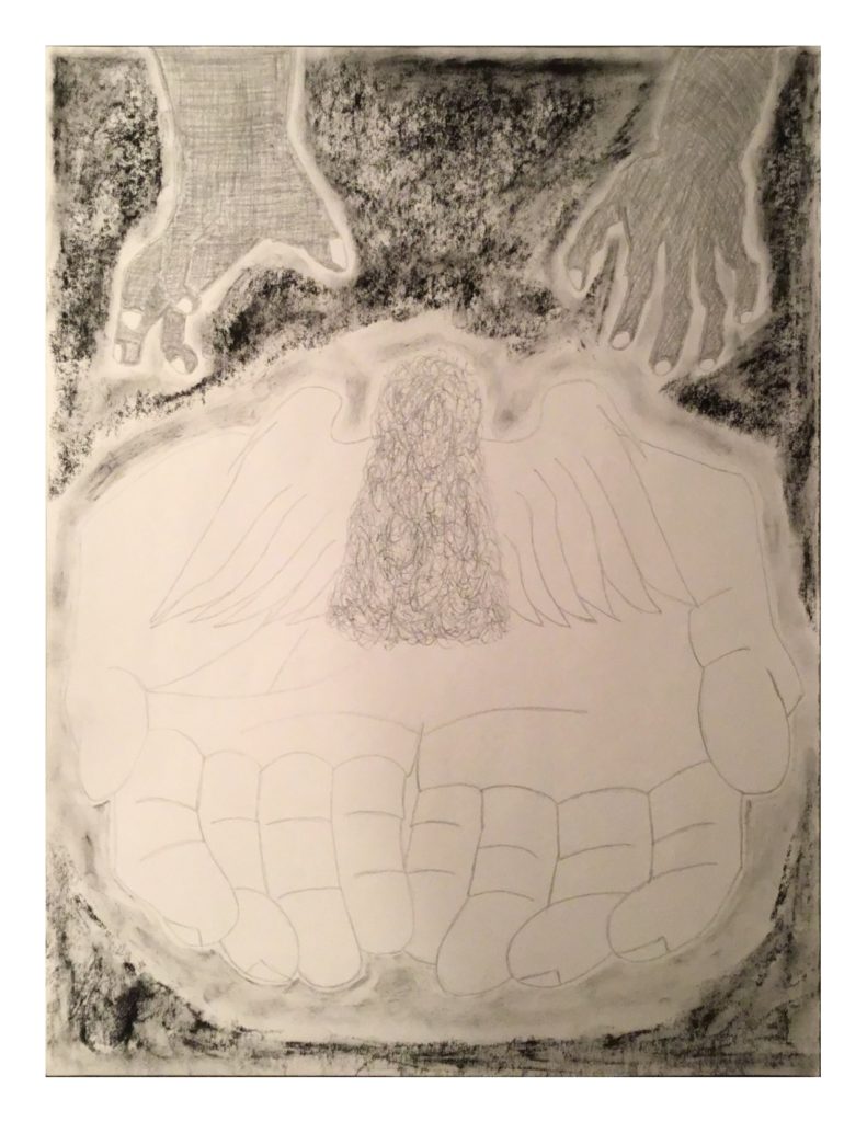
For this project, I used 2B Pencil, 2B & 6B Graphite Sticks, 4B & 6B Compressed Charcoal, and Blending Stump.
FIN 110 Unit 1
